Footer
Website design is constantly changing. Designers and user experience experts continue to bombard the market with their ideas. From new color combinations, changing image-text arrangements or recommendations of where to best place individual media elements – the plethora of tips can be confusing and overwhelming and leave website operators questioning whether their websites are still relevant at all. But there are some things that never change! Aside from a menu, all websites stand on the same structural element – the footer. In this guide, we explain what a footer is, best practices for designing one, and its advantages.
- Simple registration
- Premium TLDs at great prices
- 24/7 personal consultant included
- Free privacy protection for eligible domains
What is a footer and where can I find it?
A website footer is the visual “keystone” of a website and is located right at the bottom of a page. For a long time, it received little attention because website users were thought to be too lazy to scroll all the way to the bottom of a page. But studies have shown that users tend to look at websites in their entirety to get the information they’re after. Because website operators tend to worry that visitors may miss something, they tend to overload the header. But the information overload and lack of clear structure has the opposite effect and people tend to turn away from these websites.
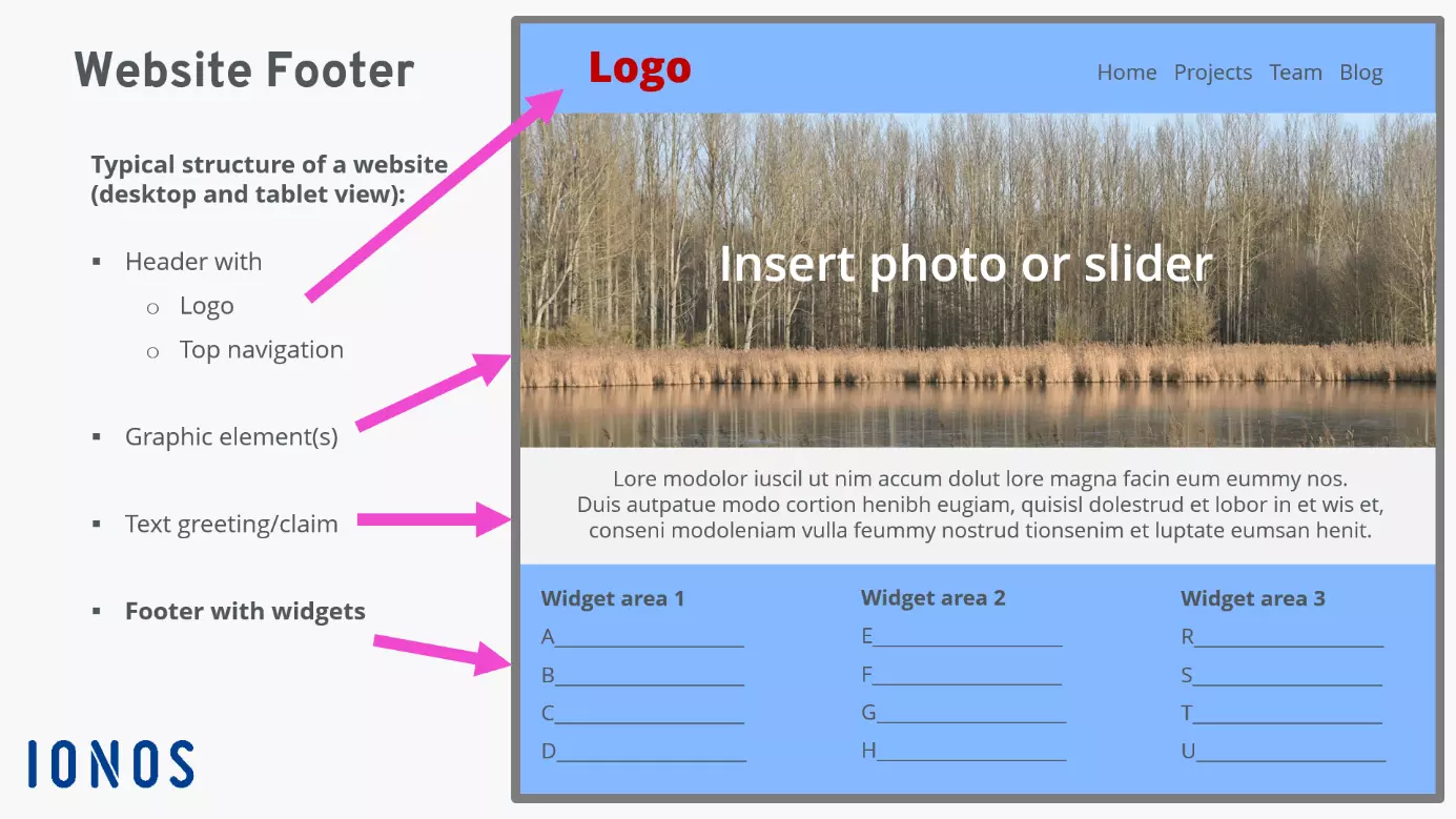
Generally, the clearer the structure of a website, the faster it will be for visitors to grasp its content. The diagram above illustrates the position of the footer as displayed on a desktop screen, laptop, or larger tablet. Thus, the footer supports website clarity and boosts the user-friendliness of the web design.
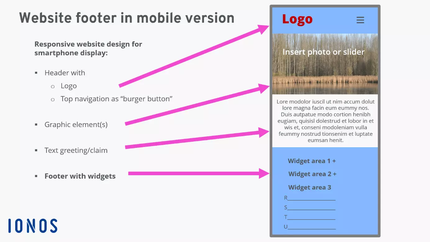
Using @media queries in the Cascading Style Sheets (CSS) website information can be adjusted for maximum user-friendliness on mobile screens.
A footer is the final section of a website. A website footer not only serves as a visual conclusion but offers plenty of options to display relevant and in-depth information.
What’s the purpose of a footer?
The footer signals the end of a web page. The implication is that the user cannot scroll further and there’s no more content to view. Users who scroll to the footer are generally looking for additional content. That’s where a website footer can come in particularly handy by linking to special or additional content. Footers give websites a professional look because the basic information contained here is always accessible.
With WordPress Hosting from IONOS, you can access thousands of website templates with suggestions for great-looking footers.
The most important function of the website footer is to provide an opportunity for additional content and promote a more user-friendly website structure, for example, by compacting the header.
Concept and design of footers
When you’re looking to integrate your website footer in a meaningful way, it’s best to take a look at your content and assess which components should or must be supplemented with repeated information. One elegant solution is to add separate menus to the footer. Content management systems provide so-called widgets to this end. A clear menu structure ensures that the footer retains the same design throughout.
With some of the most popular CMS, you can access extensive options to adapt the footer. Learn how to edit the footer in WordPress.
The footer should be clearly separated from the main content of a website. This can be achieved by using different background colors, contrasting the area to the main color of the website, adding a line to separate blocks of content, or any combination of the aforementioned. As always, less is more. You can divide the section into two to three logically connected content sections. Leave enough space between these sections, so-called white space, to avoid visual overloading. Pay close attention to the overall balance between the unique design of your website and how clear the content is because the website footer is often the final impression a user has of your website.
What goes into a footer?
There’s no hard or fast rule as to what information you should include in a footer. Relevant website content is often linked in the footer. Here are some suggestions.
Categories and blog link
A web shop could use a footer to display product categories or website sections, for example:
Collection
- Running shoes
- Walking shoes
- Health shoes
- Insoles
- Shoe care products
News websites or blogs may wish to list their latest posts in a dedicated footer widget.
Mandatory information
The website footer is a good spot to place mandatory legal information because it will be visible across all pages and sub-pages of a website. Such information could include links to an imprint and a privacy policy. Web shops could also point to their terms and conditions and cancelation policy in the footer. Not only are you conforming to legal requirements, but you’re also improving visitor trust in this way. A great addition for shops or service providers is a list of payment, delivery, and return options. Other ideas to boost trust include certificates, seals of approval, positive user feedback, and an SSL encryption notice.
Build your own stunning website and add effective and visually engaging footers with the IONOS MyWebsite builder, available free of charge for 3 months.
Contact, newsletter, app
You can improve the service of your website by adding contact details, and where applicable, times of availability. A link to frequently asked questions (FAQ) may be useful if you’re selling products or services. If your web shop has a physical store, you should add your opening times and a map of how to get there to your footer. Just as easy is the integration of Google Maps, for example.
But beware! When embedding online maps, you need to adhere to data protection rules. The transfer of user data to servers usually requires user consent. You could embed a symbol card, a photo and text to detail any data transmission. Please note that some map service providers expressly prohibit the use of blurred representations of their maps (e.g., Google Maps).
The situation is similar with social media platforms. It’s best to include an icon that links to Facebook, Google, Twitter and Co. The direct integration of their services may lead to unauthorized data transmission and could constitute a violation of data protection regulations. Luckily, when it comes to social media, there are now many web tools available to help with legally compliant embedding.
The website footer is also useful to entice users to register for newsletters. Email marketing initiatives are a great way to foster customer loyalty and trust.
If your services are accessible via an app, you could link to the relevant app stores in the footer. Because a growing number of users are accessing the web from their mobile devices, apps make for a useful addition for some businesses.
How important is the footer navigation?
When you add your website’s main menu to the footer, you’re making it easier for website visitors to navigate your page, because they don’t need to scroll to the top of the page again (with the exception of the so-called sticky menu). A display of your sitemap can be used to link pages internally.
Working with a content management system? In that case you can test the best arrangement of menus by placing them in different positions across a website. You’ll be able to readjust the design quickly if it turns out that some areas don’t work. Don’t forget to optimize the structure of your navigation to improve the usability of your website.
Website footer and SEO
Website visitors tend to rate content that is included in the top menu and also the website footer as more important and worthy of a read. This can boost the time a visitor spends on your page which in turn improves your website’s SEO ranking. Search engines are allergic to so-called “duplicate content” – content that appears at least twice (or more) across a website. Because the footer is usually copied across every page, long text passages will be considered duplicated by search engine crawlers. You can avoid duplication by saving your content to a separate page that you link to from the website footer.
Want to find out more about search engine optimization? Check out our SEO lexicon for all the most common terms.
Website footer: best practices
Below you’ll find some examples of footers that implement the requirements discussed above in different ways.
Manufactum
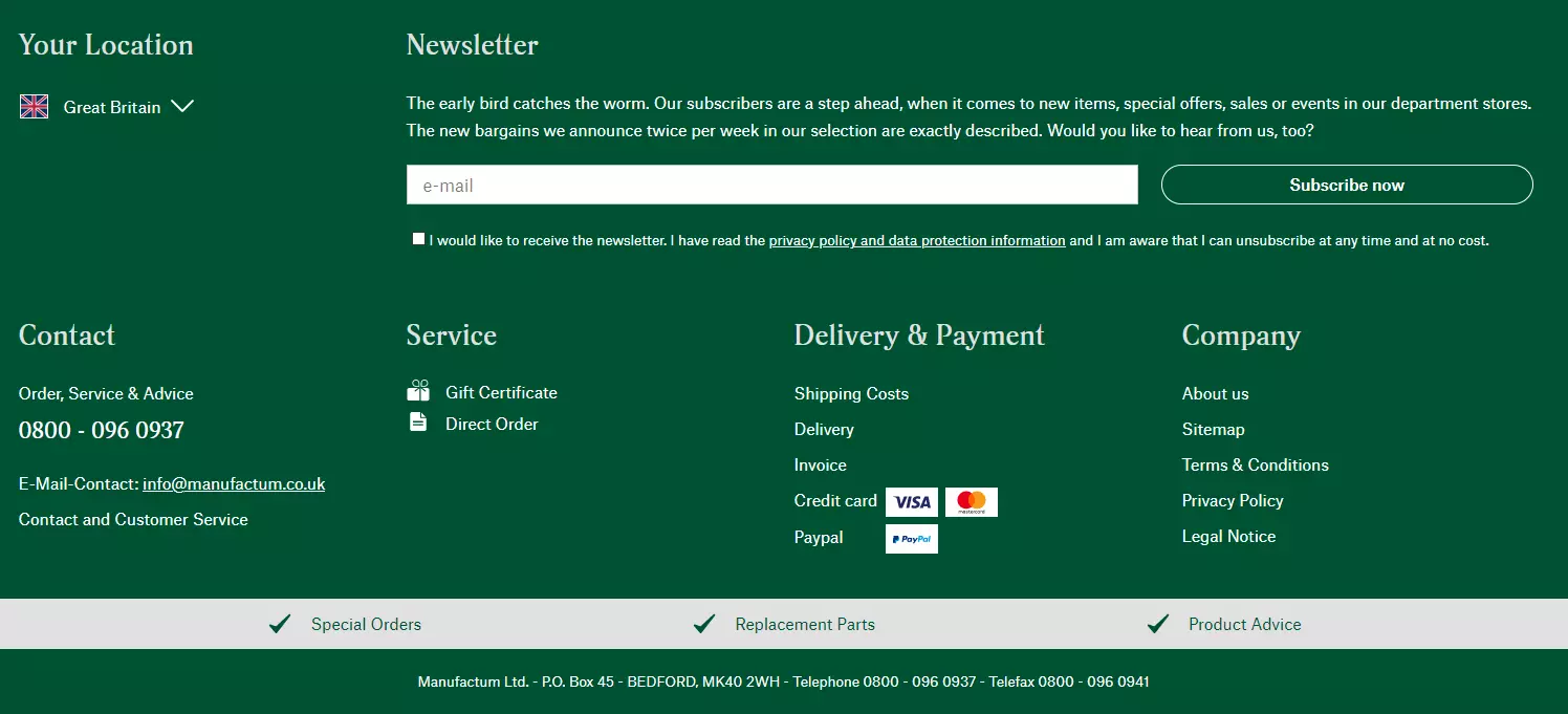
Mail order company Manufactum operates a large web shop and manages department stores across 18 locations. Correspondingly, the website’s footer is rather extensive, but retains a clear structure and encourages customers to subscribe to the firm’s newsletter by offering a voucher in return. The narrow gray bar encourages website visitors to shop across select categories.
Zalando
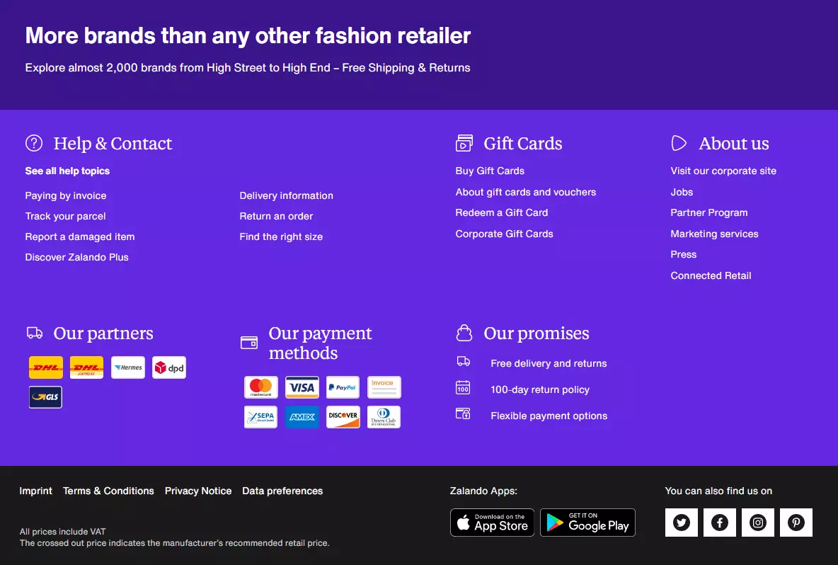
Zalando’s footer is another example of a more extensive integration, but it’s very straightforward thanks to its clear structure. The footer positions Zalando as one of Europe’s largest brands and helps customers access customer service information, gift card offers, and payment methods quickly. The footer also includes links to legal content and Zalando’s mobile apps and social media accounts.
Back Market
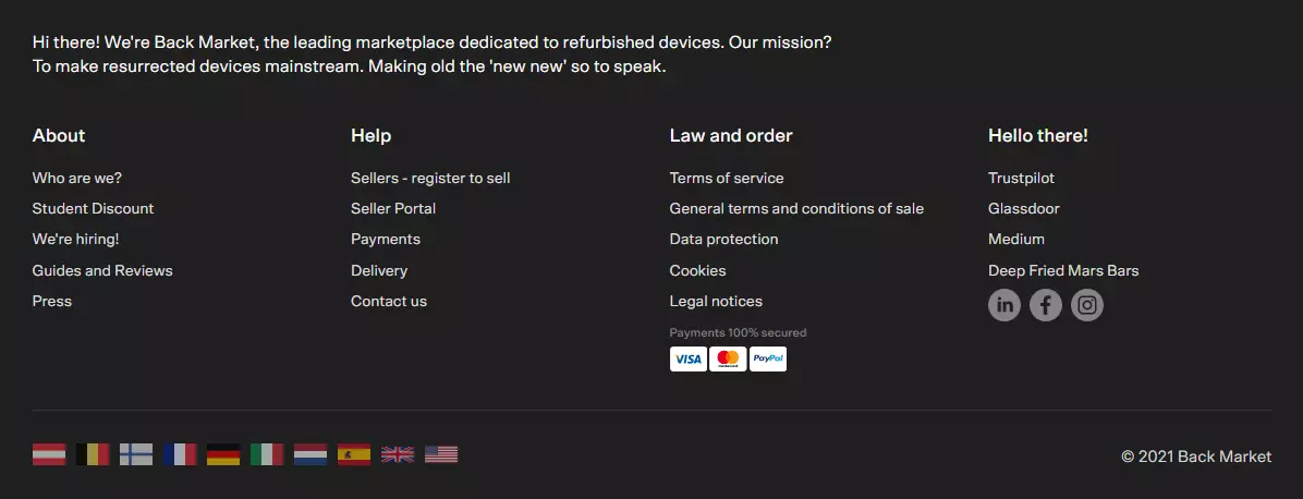
Back Market is an online marketplace that sells recycled electronics goods such as smartphones and epilators. The footer embeds a few extra features such as a link to the company’s Trustpilot review page. Integrating customer reviews radiates confidence and builds trust. Depending on the industry, embedding a link to your Glassdoor profile lets users access additional information about your business, such as salary details, reviews by existing and former staff, office photos and more. Visitors can quickly learn more about a company by accessing the “Who we are” link from the “About” section in the footer. The wide range of languages exudes an international flair. Only the Wikipedia link to “Deep Fried Mars Bars” seems a bit odd, but it shows that Back Market has a sense of humor.
ARTES Valve & Service
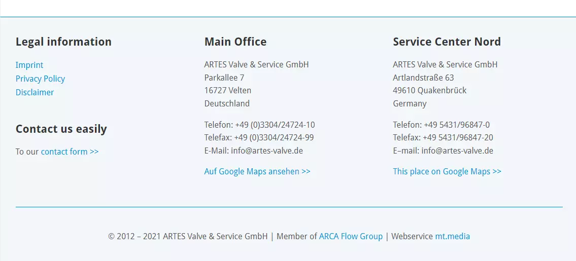
The footer of German industrial valve maker ARTES Valve & Service is straightforward and includes all the important details for clients to reach out quickly and easily and enquire about its services. The company’s contact details can be viewed in Google Maps. The website footer is optically separated from the content with a subtle contrast and a blue line.
Ultimately, what goes into the website footer depends on the industry and what you deem necessary. There’s no single “best” solution. Remember that just because you’ve finished designing your footer, doesn’t mean you can’t make changes to it later on. It’s best update a footer regularly to improve the user experience and SEO.


