The most popular web design trends for 2025
In the world of web design, there are always new trends emerging that continuously shape the future of the Internet. Currently, the most popular design ideas include visual eye-catchers such as interactive virtual 3D worlds and bright fonts, but also such welcome surprises like minigames on 404 error pages. Here, we present 15 of these trends so that you can prepare yourself for modern web design in 2025.
- Intuitive website builder with AI assistance
- Create captivating images and texts in seconds
- Domain, SSL and email included
15 web design ideas that are trending this year
If we can expect one thing from 2025, it’s continuity. In 2025, web design trends from previous years will continue to be put into practice and, the Internet landscape will not undergo any radical changes. However, some trends indicate that user experience will be top of mind for designers as they set out to shape the Internet of tomorrow, today.
- Nostalgic web design
- Interactive 3D elements and virtual worlds
- Maximalism and excess
- Web design solely for the sake of entertainment
- Creative 404 error pages
- Short videos that provide value
- Bold and unique typography
- Neomorphism
- Scrolling designs: long/infinite and parallax
- Speed/performance still important
- Personalized user experience
- Virtual and augmented reality via WebXR
- Further development of chatbots
- Socially and ecologically motivated designs
- Micro-interactions
Web design trends for 2025: New ideas for websites
Nostalgic web design
From retro images and pixel elements to navigation structures that were previously considered relics of a bygone Internet era, in 2025, visiting a number of websites will be like stepping back in time. In addition to the 1990s, the current Y2K revival has also made the 2000s a source of inspiration for modern web design.
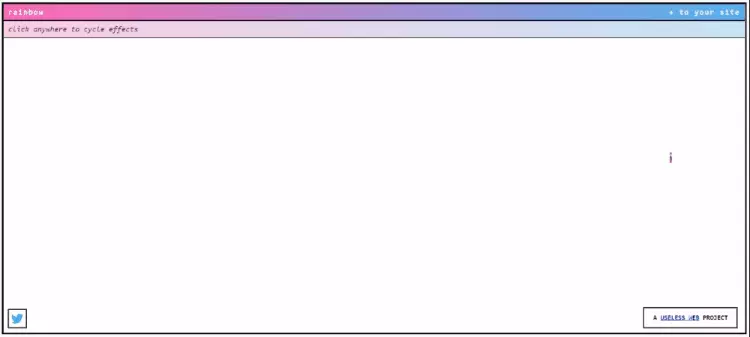
Custom cursors are rising in popularity and will be used often in the web design of 2025. Equipped with design and effect capabilities, users can design cursor icons themselves or add animation effects that are activated when the cursor is moved. The “90’s Cursor Effects” website has some great examples of different types of this retro trend.
Interactive 3D elements and virtual spaces
Among the top web design trends of 2025 are 3D effects that give websites a tangible or plastic look. The keyword here is immersion: Users can enter virtual worlds that can be navigated by clicking or scrolling. Bloomingdale’s, for example, has created a website using such technology, which allows for an immersive virtual shopping experience.
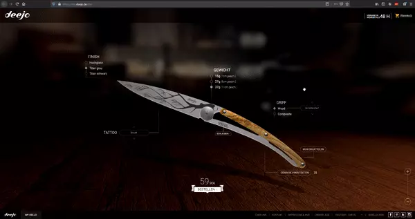
Similarly, websites with 3D elements that can be moved by mouse click or the touch of a finger are becoming more and more common. For e-commerce in particular, interactive objects of this kind offer huge potential. Customers can now conveniently view a product from all sides and from every angle to gain an optimal impression of it. This creates a shopping experience that is more in line with that of buying in a local store, where you can pick up an object and inspect it before purchasing it. You can find a great example of this on the website of the French knife supplier Deejo.
Maximalism and Excess
Another style among the web design trends for 2025 is maximalism. Unlike minimalism, which follows the maxim of “less is more”, proponents of maximalism believe that “more is more”. Crowded websites, where almost every element attempts to catch the eye in some way, are taking the lead. Animation, special click effects and colorful images are just a few examples of how this new web design trend is taking form.
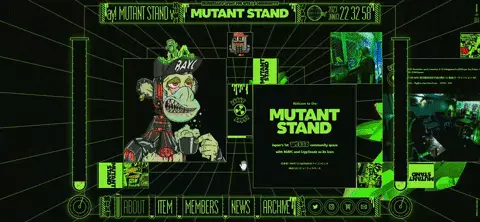
One example of a website design that doesn’t shy away from excess is the website from “MUTANT STAND”, a Web3 community space. With a neon-green color scheme, flying crystals and shifting images, it’s a prime example of web design that is both striking and modern.
Colorful or bright website designs aren’t your thing? Dark mode is a trend that is not only sweeping the web, but the entire software sector. More and more users find bright interfaces irritating, particularly in low ambient light. Operating systems as well as browsers offer a dark mode. Read more about activating dark mode in Windows 11 or using dark mode with Google Chrome
Web design solely for the sake of entertainment
The web design of 2025 also builds on elements that are entertaining but do not necessarily serve a specific purpose. Having received some pushback in recent years, this trend aims to delight and give old design components a new look.
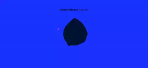
For example, the portfolio of full stack developer Francois Risoud is equipped with hover animations, causing elements of the webpage to disperse as soon as you hover the cursor over them.
Creative 404 error pages
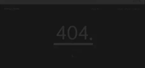
In the modern web design of 2025, 404 error pages that display originality are also taking center stage. Just like the last trend, the focus here is on entertaining users. The classic error page that appears when you call up an invalid URL is now filled with entertaining elements. What was once an irksome dead end has been transformed into an amusing diversion. Check out our article on innovative 404 error pages for examples and inspiration. One company that has embraced this web design trend is the design agency Feldman Studio. When users find themselves on their 404 error page, they can play the classic video game “Snake” and maybe even see their name displayed on the high score list.
Short videos that offer value
Incorporating video footage is a web design trend that has already established itself as the norm. However, 2025 emphasizes short clips that are not only visually impressive, but also offer added value. For example, you could implement this trend by creating an introduction video for you or your company. In a similar fashion, products can be presented in an appealing way using short videos. If you want to increase your reach, you can additionally share them on the most important social media platforms.
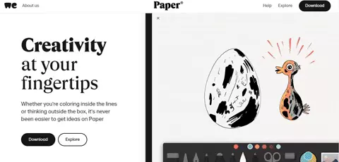
An example of this trend can be found on the website for WeTransfer’s application Paper. Curious users are greeted with a video that clearly shows the features and benefits that the app offers.
Evergreens: Web design trends that stand the test of time
Bold and unique typography
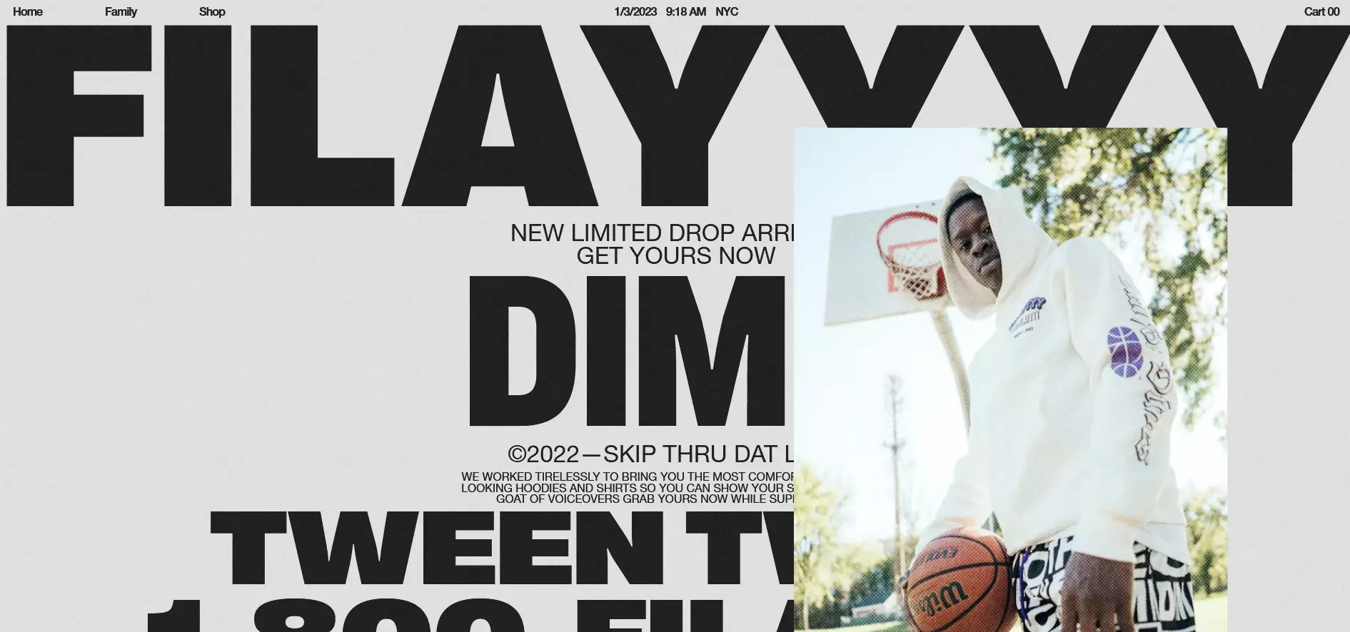
Eye-catching and distinctive fonts will continue to be on the web design agenda in 2025. This means websites will continue to greet visitors with words and phrases that practically dominate entire homepages or overshadow other elements in the name of aesthetics. This typography trend, which is also considered a feature of brutalist web design, makes one thing clear: typefaces need not only to convey information, but can also function as a supporting design element.
Fonts such as webfonts are also an important tool when it comes to giving a brand its own identity. Big names like Coca-Cola, Disney and Harry Potter, for example, have come up with custom typographies that make them identifiable around the world. Using a typeface of your own design on your website is definitely something worth considering. Try experimenting with colors and shapes, or if you want to take your fond design a step further, you can also add images and other media to individual letters.
Neomorphism
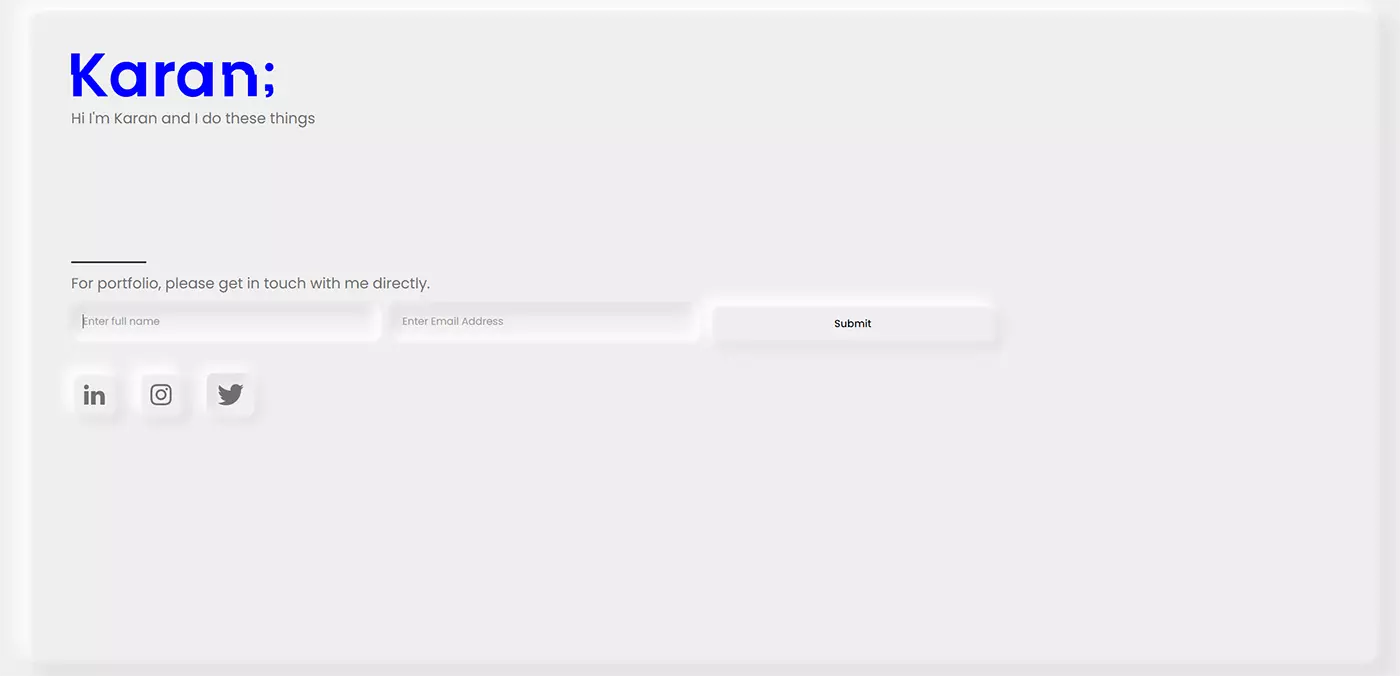
Neomorphism brings more realism to website designs, some of which have become rather abstract. This approach gives life to otherwise flat, card-based layouts. For this purpose, CSS is used to make UI components appear 3D by employing lighter and darker shadows. As a result, the individual elements seem to emerge from the screen until they are selected by the user. Once selected, they become at least visually indented, leaving a realistic impression and providing the user with feedback.
Despite its popularity, this design trend has its drawbacks. For example, users who have impaired vision aren’t able to properly grasp the fine dividing lines when viewing neomorphist elements. For this reason, the trend is increasingly moving in the direction of a neomorphism with stronger contrasts.
Classic graphics programs such as Adobe Illustrator are best suited for implementing these 3D effects. Alternatively, you can find lots of offers online, such as Neumorphism.io, which help you get on board with the neomorphism trend.
Since shadowing is the basis for neomorphism design, the web design trend doesn’t work well with web apps in dark mode. Here, you need to specifically work out which strategy better suits your project.
Scrolling design: Long/infinite and parallax scrolling
The mobile trend is already having a resounding impact on web content. One of the most important developments in this context is the transition from clicking to scrolling. In principle, the scrolling website is an old friend. However, design concepts such as parallax or infinite scrolling continue to enjoy great popularity and will, therefore, remain in trend in 2025.
Infinite scrolling
When the end of a section on a webpage has been reached and the next part is automatically shown, that’s infinite scrolling. Social networks, like Facebook, Instagram, Reddit, and Quora, have long since employed this method to present their users with content in a continual newsfeed. Infinite scrolling has also been a common tool used in blogs for some time now and is sure to play a large role in the future.
Infinite scrolling is ideal for websites with a wide range of information and is typically used with sophisticated algorithms that pre-filter information and present users with the most relevant blog posts first.
Website operators who want to jump on the infinite scrolling bandwagon in 2025, should, however, ensure they do so in a search-engine-friendly way. While Google initially struggled with crawling websites that scroll, infinite scrolling can now be implemented without worry thanks to detailed design guidelines from the search engine market leader. The following points should be taken into consideration:
- Individual URL for every subpage
- Overlapping content should be strictly avoided
- Visitors should be able to easily locate the information they are looking for
- Loading time should be reasonable
An example of implementing infinite scrolling in a search-engine-friendly way is featured on the demo website from John Mueller, Search advocate and senior Search analyst at Google.
Parallax scrolling effect
Although parallax scrolling may not be among the newest web design trends, it is definitely one of the most popular ones. Motion parallax has been an essential building block for modern websites over the past few years. The special ability to move various levels of a website at different speeds creates depth perception. These special visual effects keep visitors plugged in and scrolling and, as a result, they stay on the page longer. These effects are ideally combined with elements that prompt the visitor to carry out a desired action. For this reason, parallax scrolling is an excellent feature to use in tandem with interactive storytelling.
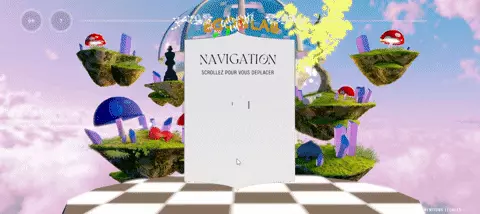
In 2025, users can also expect parallax zoom scrolling on websites. In this case, scrolling does not cause a vertical or horizontal movement, but rather zooms in or out. This gives sighted people the feeling of being taken on a journey. The website “Wonderland Digitalfashion” illustrates this trend very clearly using 3D effects.
Speed and performance remain important
Not so much a trend as a basic principle of a well-designed website: Speed continues to gain importance. This is partly thanks to the mobile revolution. After all, website owners want their sites to be easily accessible on the go and not to use up too much data volume. The faster a website loads, the better the user experience. It’s been this way for at least ten years. In 2025, this trend will continue, with many working intensively with lazy loading to enable faster website use.
Certain trends in web design directly influence the loading times for a website. For example, minimalism forgoes memory-intensive media, opting instead for formats that keep memory requirements low. “Long scrolling” websites, which place all the necessary information on a single scrollable page, are often chosen because only one page needs to be loaded and not several sub-pages afterwards. Also, the use of “white space” means there are fewer elements to slow down the website’s loading speed.
Many modern web design trends, such as interactive animations look eye-catching and can help the visitor absorb the information better (if used correctly). However, elaborate website designs often have a negative impact on performance. Web designers must therefore carefully consider which multimedia and interactive content offers added value for the user and which only slows down the website unnecessarily. Generally, less is more, but that does not necessarily mean you have to return to flat design.
The performance of a website has a direct impact on the user experience. A distinction must be made between actual and perceived loading time. Delays are only problematic if they are perceived as such by the user. Web designers therefore rely on the following measures, among others, to compensate for longer loading times:
Progress indicator
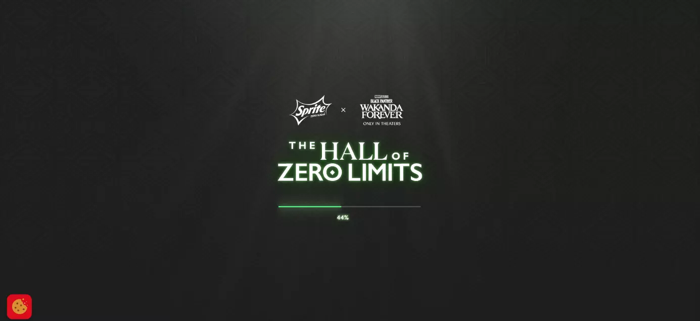
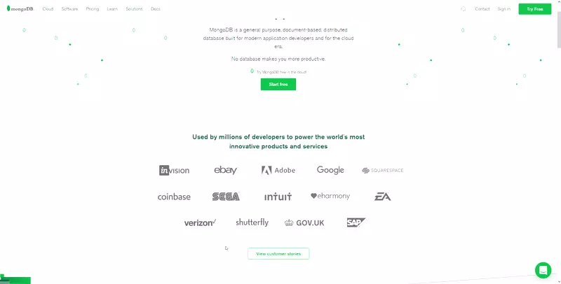
If the visitor must wait, they should at least know how long it will take. The progress bar doesn’t shorten the loading time, but it can make it more entertaining if it is designed in an interesting way. The aim is to keep the user on the site even if they are made to wait. After all, Internet users today are becoming more impatient when it comes to accessing websites.
Chatbots
Communication programs are nothing new. Chatbots originate from the research area of Artificial Intelligence (AI) and are already used on corporate websites or online stores. Usually, these are small dialog boxes that accept user questions and automatically generate responses. The machine’s learning algorithm creates personalized answers, which gives the user the impression that they are speaking with a human. Chatbots are used as virtual shopping assistants or as an alternative to the classic FAQ section.
Chatbots are rarely intrusive but are usually operated via small interactive elements. The user, therefore, gets the impression that they are being contacted in real-time by an employee of the web service. In most cases, the user can respond to the request without leaving the website. The distrust of AI-controlled dialog partners has probably subsided somewhat since the success of Siri, Alexa, Cortana, etc. In most cases, however, chatbots are (still) nothing more than search bars that react more dynamically to search queries. It will be interesting to see how chatbots develop in 2022.
Speed/performance becomes even more important
Not so much a trend as a basic principle of a well-designed website: Speed is becoming increasingly important. This is partly thanks to the mobile revolution, after all, website owners want their sites to be easily accessible on the go and not to use up too much data volume. The faster a website loads, the better the user experience – it’s been this way for at least ten years. In 2022, the trend of forgoing time-consuming and memory-intensive elements and working intensively with lazy loading will continue to enable faster website use.
Many other trends in web design stem from this one. For example, the increasing minimalism in many website designs means no more memory-intensive media, and many formats are chosen specifically to keep the memory requirements low. “Long scrolling” websites, which place all the necessary information on a single scrollable page, are often chosen because only one page needs to be loaded - and not several sub-pages afterwards. Also, the increasingly popular “white space” means there are no elements that could slow down the website’s loading speed.
Load key elements first
Web pages should be programmed so that “above the fold” content is retrieved first and displayed in the browser. These are the parts of the page that are visible to the viewer without them having to scroll down. If this content is available, it doesn’t matter to the user whether additional content (“below the fold”) is loaded later.
Progressive JPEGs
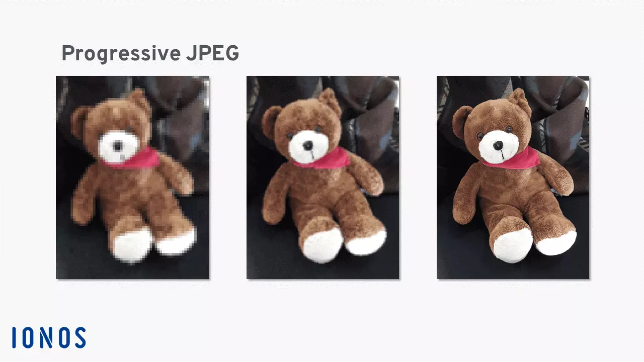
Images embedded as progressive JPEGs do not build up from top to bottom in the final resolution when loaded. Instead, interlaced scanning is used so that the viewer is first presented with a preview image that’s low quality. The image is then gradually refined until the data for the desired image quality has been completely loaded.
More tricks to improve website performance can be found in our article on website optimization.
In summary, what applies to content also applies to videos, photos, and gimmicks: they should be of high quality, unique, and relevant to the user. In addition, it makes sense that content like this is only loaded when the visitor accesses it. Mobile device users or weaker internet connections benefit from well-structured websites that are free of unnecessary data burdens.
WebAssembly
Web applications are an essential part of the Internet experience and for good reason. JavaScript enables website visitors to interact with a site which improves their experience. But many web applications hinder performance. WebAssembly (Wasm) is a newly developed language which is more rapidly executed in a browser because it’s precompiled. While Wasm isn’t widespread just yet, but modern browsers are already able to handle the technology.
Personalized user experience
Targeted presentation of web content is one of the basic principles of modern web design. Especially in e-commerce, the selection of content and its presentation should be based on the requirements of potential customers. In the past, the focus has been on abstract groups of people, but in 2025, the focus has shifted to the user experience.
A web design trend that will continue to be relevant in 2025 is personalized websites, where visitors see content that matches their usage habits. Web analysis tools such as Google Analytics and Matomo provide the foundations for personalized user interfaces. They give content providers a comprehensive overview of how web users interact with web content.
Do you rely on WordPress for your web project? With WordPress hosting from IONOS, you get a perfectly administered package of the popular content management system including hosting, SSL/TLS certification, and your own domain.
Virtual and augmented reality via WebXR
Most users are aware of virtual reality (VR) within an entertainment context. Computer and mobile game developers, for example, invest many resources into VR technologies to create VR glasses and games. In recent years, more and more apps have also come onto the market that not only have augmented reality (AR) as a fun concept, but also use the technology for practical purposes. For example, a real environment is mixed with digital input so that the interior design of an apartment can be planned out, or clothing can be tried on virtually. The World Wide Web is following these trends. The fault ridden WebVR technology has now been replaced by WebXR technology, which displays VR and AR content in browsers.
Users can already view specially programmed websites in three dimensions using VR glasses. Much like navigating a room, they can move between menu options and content. The technology holds much promise for the future of e-commerce, allowing online shops to replicate the in-store experience online. Those who own VR glasses can already test WebXR by Mozilla.
Further development of chatbots
Communication programs are nothing new. Chatbots originate from the research area of Artificial Intelligence (AI) and are already used on corporate websites or in online stores. Usually, these are small dialog boxes that accept user questions and automatically generate responses. The machine’s learning algorithm creates personalized answers, which gives the user the impression that they are speaking with a human. Chatbots are used as virtual shopping assistants or as an alternative to the classic FAQ section.
Chatbots are rarely intrusive but are usually operated via small interactive elements. The user, therefore, gets the impression that they are being contacted in real-time by an employee of the web service. In most cases, the user can respond to the request without leaving the website. The distrust of AI-controlled dialog partners has probably subsided somewhat since the success of Siri, Alexa, Cortana, etc. In most cases, however, chatbots are (still) nothing more than search bars that react more dynamically to search queries. It will be interesting to see how chatbots develop in 2025.
Socially and ecologically motivated designs
Social and ecological issues have gained a significant amount of attention in recent years. Likewise, the necessity and importance of active participation online has also become more pronounced. Due to these changes, more and more companies are making an effort to connect with customers and users more intensively and on a deeper level through online channels.
Sustainability efforts and social commitment have a significantly greater influence on web design than they did a few years ago. Prominently placed photos, videos, visualizations or simulations are just as trendy as a concrete design when used to show your company’s participation.
Micro-interactions
Micro-interactions are a trend in UX design where selected user interactions are accompanied by small animation effects. For example, this could be a like-button that makes a user’s smartphone vibrate when they click on it. For UX experts such as Dan Saffer, these are the details that distinguish the user experience.
Examples of successful animations for implementing micro-interactions can be found on Awwwards.com or Dribbble.
What will define web design in 2025?
Web design in 2025 emphasizes visual individuality and entertainment. 3-D elements, interactive components and large typography are just a few elements that will be displayed across websites this year.
Additionally, we’ve seen a shift in web design practices towards a greater emphasis on mobile adaptations. Websites should aim to be even more efficient and user-friendly to keep up with the competitive online market. Nevertheless, countertrends such as maximalism and excess, which were long considered design disasters, can now be observed again. Improved technology makes it possible to employ such an aesthetic in web design without sacrificing website performance.
With usability being as relevant as ever, websites must ensure that they are “user-friendly” across the board. Responsive web design is an important trend for the mobile market. It emphasizes technical flexibility while also taking the user’s device into account. Modern web design therefore means that a website “reacts” effectively to the user’s device and displays information accordingly. Responsive web design is consciously designed so that websites can react well to new or previously unfamiliar systems. Web designers no longer develop sites just for browsers anymore. Many of the best-known website providers enable easier mobile use via their own apps.
Some web design buzzwords are following us into 2025. On the one hand, there is the Internet of Things, which sees an increasing digitalization of everyday life and wants to offer users even more interaction possibilities. On the other hand, there have been significant advances in artificial intelligence research resulting in the improvement of automated web services. This is something web designers are likely to fully use to their advantage.
Among the most important new trends is the more targeted integration of interactive 3D effects and VR/AR elements. Both techniques make web projects more interactive with cool optical illusions
Trends and countertrends in web design
Web design trends don’t exist in a vacuum; countertrends have emerged pulling certain design elements in a different or opposite direction. Sometimes countertrends develop from a reaction to certain trends as they become more apparent. Web designers often rely on countertrends to stand out as the Internet designers of the future. Here are some examples of trends and corresponding countertrends that we will encounter in 2025.
| Trend | Countertrend |
| Stock images: professional images of stock agencies that can be integrated into many different websites - a secure way to decorate your website. | Individual or authentic images: that radiate closeness and show people or companies as they really are to connect with visitors on a more personal level. |
| Symmetrical shapes: box shapes, flat grids e.g., horizontal-vertical web pages that are very easy to navigate; these pages follow the proven and familiar “rectangular” nature of HTML and CSS. | Asymmetric shapes: experimental designs, “broken grid”, just innovatively designed web interfaces, which go against common conventions and stand out through individualism and playfulness. |
| One-page-designs: all the important information is presented on a single page and the user is spared as many clicks as possible; it is better to let the (increasingly mobile) user scroll rather than click. Certain standard layouts are gaining acceptance, especially for digital companies. | Web-nostalgic design trends: bring back the principles of the Internet interfaces of the 2000s (“web brutalism”, minimalism, text-based) or technical innovation menu bars and buttons that are still necessary to navigate the website but are not too bulky for mobile use (hamburger menus, micro-interactions). |
| Colorful designs and strong complementary colors that give the website a certain flair; in addition, there is a deliberately used color symbolism or color association (blue for digital products, green for charitable companies, pink for cosmetics, etc.) to subconsciously “pre-color” the page for the user. | Color minimalism: add lots of white space to distract as little as possible from the information provided. Strictly two-color websites (“duotone”) focus on user-friendliness and forego complex color design. In contrast, more attention is often drawn to brands and symbols. |
Summary: Success with web design trends
Web design trends in 2025 are diverse and include everything from one-of-a-kind looks to interactive highlights. 3D virtual worlds and bold typographies transform websites into digital eye-catchers, while animation and scrolling effects breathe life into an abstract online world. No matter which path a web designer chooses, every designer has fast access and optimal cross-device displaying on their to-do list this year.
Modern web design provides new possibilities to create websites that invite visitors to linger without overcrowding them with different elements (unless maximalism is the intended design goal, of course). But remember, trends will change, new technologies will emerge, however, at the end of the day, the user experience should always be in the foreground. Web design and content should be designed with your target audience in mind.
If you’re building your own website or want to update your existing one, you can take inspiration from the web design trends of 2025. This will help you to prepare your website for the needs and expectations of the future.
