Google Data Studio: setting the scene with your data
Data analysis is an important part of daily life for most digital marketing professionals. All relevant data must be collected, filtered, and then summarized. In order to create an appealing presentation for your customers or your own employees, it is essential to process the gathered information in a clear and interesting manner. This task isn’t easy for everyone, but with the right tools, visual data analysis shouldn’t be problematic. It is necessary to find a way to give your customers a good overview of the analysis information of current campaigns or websites. Google Analytics is an almost indispensable standard when it comes to data collection but analyzing and processing information is a rather complex process. The workflow looks similar in most agencies so far: customers are able to access the appropriate analytics reports, which are usually compiled manually from Google Analytics and inserted into Excel tables. It’s then possible to create charts and other visual material from these tables. The Google Data Studio is designed to make visual data analysis much easier. The new tool is part of Google Analytics 360 Suite. This high-end package is the premium version of Google Analytics Enterprise but there’s also a free version that is particularly suitable for small agencies or individual entrepreneurs. The free version of the Google Analytics Suite is intended to provide a taster and show what the full version is capable of.
What exactly is Google Data Studio?
Google Data Studio promises a comprehensive selection of tools that you can use to visualize your customer’s data. The goal is to convey the information to the customer via modern data visualization in an easy way.
The individually compiled reports summarize the quintessence of larger data volumes in a clear and easy-to-understand way. The data reports are easy to read and share with third parties. With just a few clicks you can create various types of analysis graphs: bar graphs, line graphs, pie charts and other forms of data visualization. You can change fonts, colors, and color gradients, as well as add your personal logo to the report.
One advantage of Google Data Studio is the versatility of integrating data that is not inherently part of Google. For example, you can import Facebook data as long as you paste this information into a Google Sheet. The following programs can be directly imported:
- AdWords
- Attribution 360
- BigQuery
- Soundcloud SQL
- Google Analytics
- MySQL
- YouTube Analytics
Theoretically, however, you can include all the data you enter into a Google Sheet into the Google Data Studio’s data collection. When you gather relevant information from a variety of sources, you can put your measured data in a larger context and increase the accuracy of your report.
It is also advantageous that the generated reports are dynamic and update independently. In practice, changing the numeric value in the data source automatically affects all visualizations of your reports associated with the corresponding source. When you enter and save changes or update docs, sheets, or any other program, you will immediately see your changes in the Data Studio report.
With Google Data Studio, you can enable multiple user access to your reports. You can simply allow other people to view the reports and make changes if necessary. This means that your business, agency, and customers can use the reports without having access to the Google Analytics accounts.
With these permission settings, you can also decide who has access to which specific Google documents. You can also specify who can make changes to them. Google Data Studio automatically integrates Google Docs and Spreadsheets so that you only need to click on the 'share' button to allow your customers or other members of your team to view or edit the reports.
Differences between Google Analytics 360 Suite and Google Data Studio
Google Analytics 360 Suite ist die Vollversion von Google Data Studio und besteht aus den folgenden sechs Teilbereichen:
- Tag Manager 360
Data collection area: more data and less effort with powerful APIs
- Analytics 360
Area for digital analytics: helpful for creating a comprehensive overview for your customers
- Attribution 360
Area for marketing analytics: estimate the current value of your marketing channels correctly
- Optimize 360
Area for personalization: test new ways to optimize your data
- Audience Center 360
Area for audience analytics: send the right message to the right audience
- Data Studio 360
Area for data analysis and visualization: create appealing and shared reports from all your data
In the free version (Google Data Studio) you have access to the latest versions of Google Analytics, Tag Manager, and the Data Studio Dashboard. The setup is simple: you just need a Google account to sign up for DataStudio.
While the first five functions focus on collecting, analyzing, and processing data, the Data Studio aims to interpret the data. The existing data can then be put into a visual form according to your ideas. Ideally, you will recognize the connections between your data better and will get new insights thanks to the visualization of the data.
There are still some restrictions in the free version. Google Data Studio limits the number of reports to five a day but this will soon change. It was officially announced that Google Data Studio users will soon have the opportunity to create and share an unlimited number of reports every day. This was previously only offered to those using the full version.
However, this does not mean that the model will be permanently cast aside because of DataStudio 360. There will surely be some functions exclusive to the full version in the future but the 'small' studio will always be available to give some options to all users.
What exactly can I do with Google Data Studio?
The central function of Google Data Studio is to prepare existing data to compile a clearly understandable report. The following guidelines for an ideal workflow help to make this as effective as possible.
Collecting
The first step is to gather all relevant data that you want to use for your project. As already mentioned, you should use a wide range of sources to obtain the most comprehensive and accurate report as possible. Check whether an overhaul is required. You may need to convert your data to other units, such as from centimeters into inches. Different formatting can also cause problems when transferring. You need to integrate your data into a Google sheet with uniform formatting in order to make the best possible use of it.
Visualizing
Once the data has been collected, you can start the visual implementation. Remember to arrange your graphics clearly. You can select a template in Google Data Studio or build your report according to your individual preferences. The viewer should be able to follow your presentation intuitively, even if you have a large amount of data to process.
In the Google Data Studio, you have many templates to choose from to create your report. The standard templates are designed in such a way that you can easily display different data sets from the Analytics Suite. This may be helpful but the presentations could also contain information that you may not want to present. With the 'blank' template, on the other hand, you have the possibility to integrate the various elements of the report as you choose.
Example: marketing report
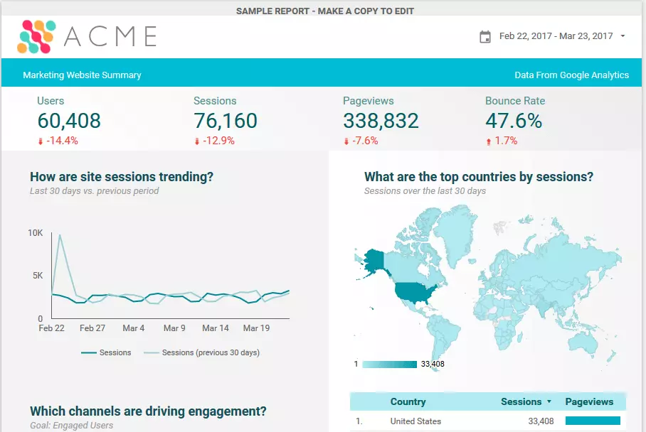
An example of Google Data Studio being in use is when you create a marketing report. In the header, you can insert your logo and provide additional information such as the date and time. The following image shows the visual elements of a typical marketing report in the Google Data Studio:
The most important figures are located just under the header. The viewer can see the absolute figures straight away as well as the percentage trend values. The graph and the geo map are color-coordinated with the logo and fit well into the overall image.
You can copy and save this sample template to use for your own data if the design appeals to you.
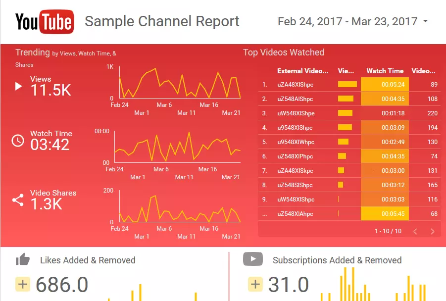
The YouTube report template is particularly interesting for social media marketers. The most important information is highlighted in red, catching your eye immediately. The individual performance of each of the most successful videos is displayed in a simple bar graph on the right. The 'trending' area on the left provides a quick overview of the number of views, watch time, and number of video shares.
Sharing
The result of your work in the Google Data Studio is primarily meant to provide insights. Simply share your report with your colleagues as a 'rehearsal' for the presentation that will be in front of your customer. Internal feedback is hugely helpful – with one click, you can send your report to a colleague or friend. However, if there’s any sensitive data involved, you should be careful when you share.
Sharing your reports with your customers is a great way to compare your digital marketing with that of others. You have immediate access to the reports that can be adapted to the current data in real-time, and your customers can also see the progress of their efforts at the same time during the project’s lifetime. It’s up to you what exactly you want to share or release for editing.
How is the Google Data Studio built?
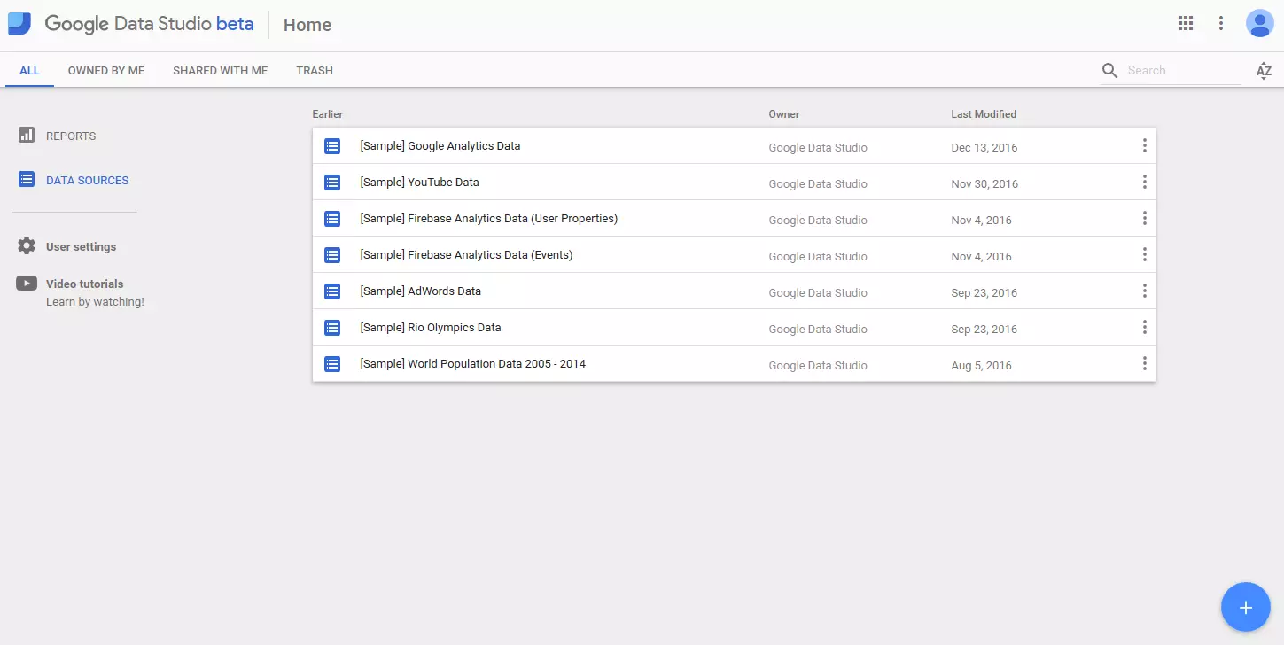
The Google Data Studio user interface is fairly simple but how does it work? If you have multiple Google accounts, you can first select one that you want to use to log in. On the home screen, you can see all the reports and data sources that you have already created or shared.
The central starting point for your report is the Data Sources area. This user interface is used to connect up your various sets of compiled data. Click 'data sources' in the left sidebar. You may already see some data sources that have been imported automatically. In any case, you will see a plus sign in the lower right corner. Click to create a new data source.
Now decide where you want to import the data: Google Analytics, BigQuery, Sheets, or any other source. Select an account that you have access to, then click the 'Connect' button.
The three levels in the Google Data Studio
One of the most useful features of the Google Data Studio is the fact that you can edit data sources on three different levels:
Report level: the most important component in DataStudio’s workflow. If you attach a data source to a report, you can use the data contained on all pages of the report. It is possible to attach several sources to a report. However, it is recommended that you select a source as the default for the entire report in case a data source is missing or isn’t working properly on the page level or diagram level.
Page level: here you can find an overview of all pages of your report. When you include a data source on a page, you can define the source on this particular page as the default, even if a different data source is set as the default on the report level.
Diagram level: here you can see the graphical representation of your data. This area represents the lowest level in the Google Data Studio hierarchy. At this level, your binary data is converted into visual forms.
Editing data sources in the Google Data Studio
Field type: select the formatting of your metric. The following options are available:
- numerical: arrange your data by the numerical value
- date & time: with this option, your data is sorted chronologically
- boolean: this setting is useful for binary data because it arranges all information according to the mathematical principle 'true' or 'false'
- geographical: arrange your content according to geographical location
Field aggregation: choose the grouping you want to use for your metric. For example, if your metric is a ratio such as a conversion rate, use the average. If it is an absolute value, you should use the totals.
Filter settings
Filter settings are indispensable when it comes to a comprehensive analysis. You can use filters to include or exclude specific data sets in your report. If, for example, you specify an inclusion filter, you will only be shown data sets that meet these conditions. For exclusion filters, the opposite is true: only the data sets that do NOT match the conditions listed, are shown.
How should you best design the filters? Ideally, you would have a set of consistent filters on all pages of the report to make it easier for the viewer to see the data. If this is not possible, you can at least try to make the filters similar.
A filter condition consists of at least one clause. Multiple clauses can be combined with the 'or' logic (true, if one of the conditions applies) or the 'and' logic (true, if all conditions apply). A combination of both logics is also possible.
To specify a filter condition, select a dimension (e.g. country) or a measurement (e.g. price) and an operator (e.g. 'equal to or greater than') and enter a comparison value (e.g. 'USA' or '500').
You can filter the following components in your report:
- Quantity: for example, by filtering 'sold quantity is greater than 100', your customers can select products from a list of the best-selling products.
- Charts: you can use a 'country' filter to create a pie chart to geographically compare customers across your most important markets.
- Reports: a report-level filter affects every chart in the report. If you want to create a report for your most important customers, set the lifetime value 'greater than or equal to x' as the filter property on the report level.
- Pages: filters on the page level affect each chart on the respective page. For example, it is possible to use the first page of your report for app traffic and the second page for desktop traffic by filtering using 'device category'.
Best practices for design in the Google Data Studio
When it comes to visualization, it is always a question of presenting abstract connections in an intelligible visual form. In online marketing, visualizations are used to illustrate key figures and developments in order to provide convincing arguments. Which design elements can you use here?
In general, it really helps if the report has a uniform design so that the viewer is not distracted by deviations in the graphic design and can concentrate more on the content.
A header can be a simple and effective element to enhance the recognition value in a multi-page report. You can see straight away what’s relevant on each specific page in the Google Data Studio. In the header, you can conveniently place more information there for the viewer to see, such as links to other resources.
Page dividers can be an effective means of separating the different types of content in the Google Data Studio. For example, if you place data on a page for different business sectors, you can use page dividers to make the division more obvious.
When designing infographics, the rule is that your report will be more visually appealing if you make your charts colorful (within reason). A report that contains only tables or only bar graphs can quickly bore or even intimidate the viewer. Of course, you can also include minimalist curve diagrams for trends and bar charts for comparing different groups. Tables are ok but it’s better if you use a mixture of everything.
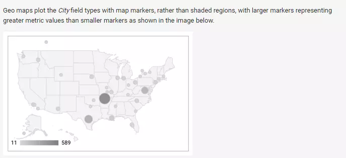
As a rule, a well-designed infographic should consist of no more than five colors. The basic information looks best in gray tones. Signal colors such as red or orange should be used sparingly. Google Data Studio has all common art formats, with geo maps being especially visually appealing.
Once the report is complete, you can share it with your recipient groups. Note that the recipient’s email address must be connected to a Google account. If this is not the case, the recipient will receive an error message and not see the dashboard.
What could be improved in the Google Data Studio?
There are still some things that could be improved. For example, exchanging data with the linked Google Sheet isn’t always easy. It could be that modified dimension names or values of metrics aren’t transferred over immediately. Also, some formatting of figures isn’t always recognized. In concrete terms, this means that decimal formatting (0.25) results from a percentage format (25%).
Summary
All in all, Google Data Studio is an effective tool that will definitely simplify visual data analysis. Due to the intuitive user interface, the Google Data Studio can be very useful for beginners. The program doesn’t target professional analysts. There are more precise tools out there for experts. For agencies, bloggers, and YouTube channel operators, however, the studio is a worthwhile application for processing collected data in a meaningful way.


